Creating a User Interface with Tabbed Views
To create a user interface with tabbed views you have to use the following elements:
- Additional views
- "Tab View" widget
Each additional view represents a tab card in the Frontend. Therefore you have to add as many additional views as the tab cards you want to visualize in the Frontend. The main view that is displayed by default in the Designer is generally used for the "Tab View" widget, especially if you want the tab cards to fill the complete area of the Frontend. To get more information about how to add additional views, please refer to the chapter Adding and Deleting Views.
How to Create a User Interface with Tabbed Views
If you have added the additional views, you can start to create a user interface with tabbed views by configuring the respective workspace of each view. The following steps accomplish this task:
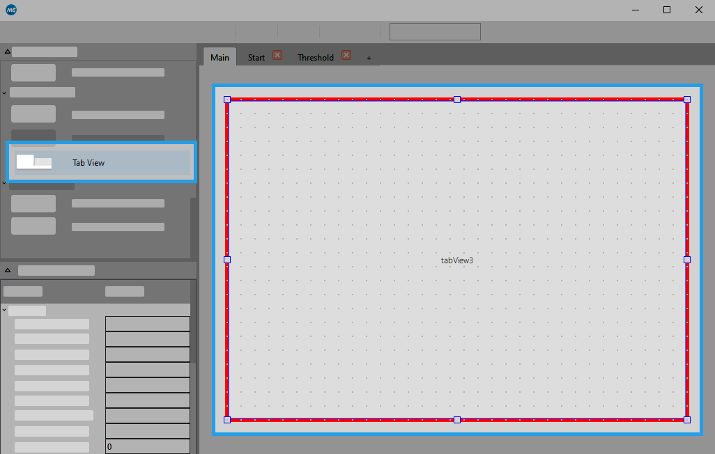
 1. Adding the "Tab View" widget
The Tab View widget is necessary for the visualization of the tab cards. To ensure that the tab cards are instantly visualized when the Frontend is opened, you have to add the widget to the start view of the Frontend, i.e., the view that is displayed when the Frontend is opened. By default the main view is also the start view. Therefore, you have to add the widget to the workspace of the main view.
If you have enabled the user management for your application you can define the start view individually for each user group. In this case you have to use the "Tab View" widget in the respective start view.
- Select the widget "Tab View" from the "Widget Library" and insert it to the start view.
- Adjust the size of the widget:
- If you want the tab cards to fill the complete Frontend window, fit the size of the widget to the size of the workspace.
- Otherwise adjust the widget to the size in which you want to visualize the tab cards.
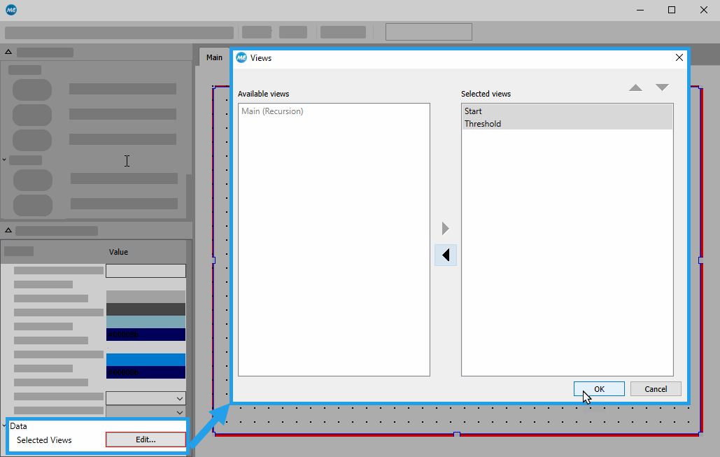
2. Selecting the views to be displayed
- Select the "Tab View" widget in the workspace to display its properties in the properties panel.
- Open the edit dialog of the property "Selected Views".
- Select the views you want to visualize and add them to the list of selected views. In the Frontend each view will be displayed in its own tab card.
- Sort the selected views according to your preferences. The order of the views defines the order in which their respective tab cards will be arranged in the Frontend. The first view in the list will be visualized in the first tab card and so on.
- Click "OK" to confirm your selection.
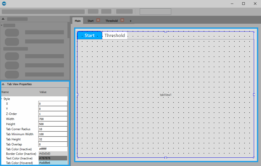
3. Customizing the design of the tabbed views
- Ensure that the properties panel still shows the properties of the "Tab View" widget. Otherwise, click on the widget in the workspace to display its properties.
- Adjust the properties of the widget according to your preferences, e.g., the color or font of the tabs. The changes are instantly visible in the workspace.
4. Customizing the user interface of the additional views
- Change to the view you want to adjust.
- Optionally, adjust the size of the workspace. To ensure that the complete workspace of the view is visible in the respective tab card without using additional scrollbars, you have to reduce the size of the workspace to be slightly smaller than the "Tab View" widget in the start view. If the workspace of the view has the same size as the "Tab View" widget, only the inner part of the view might be visible in the tab card because the border and the title of the tab cards also take some space. In our example we reduced the width of the workspace by 20px and the height by 30px.
- Customize the user interface of the view by adding and adjusting the available widgets according to your preferences. The image below shows an example of a possible user interface design for the additional view "Start". It has been designed to control the execution of the application and to check the results.
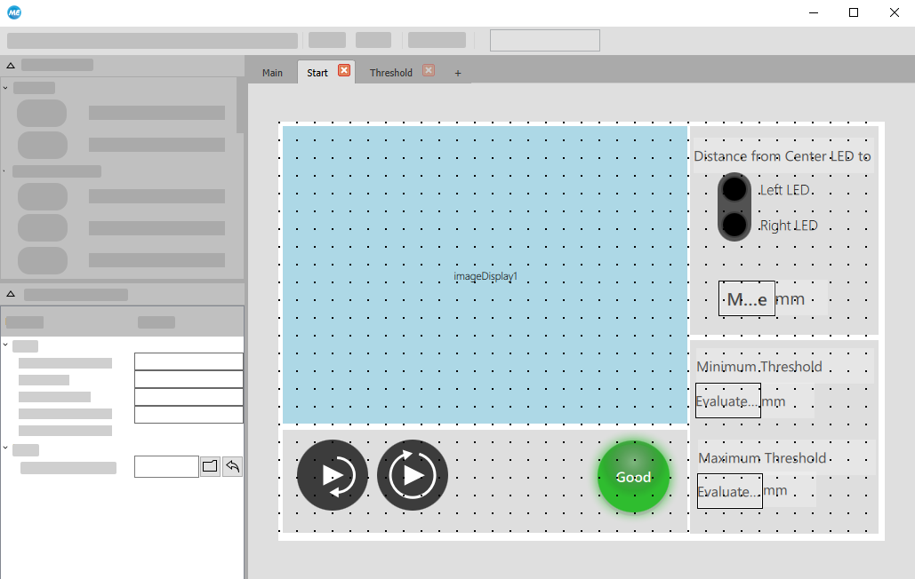
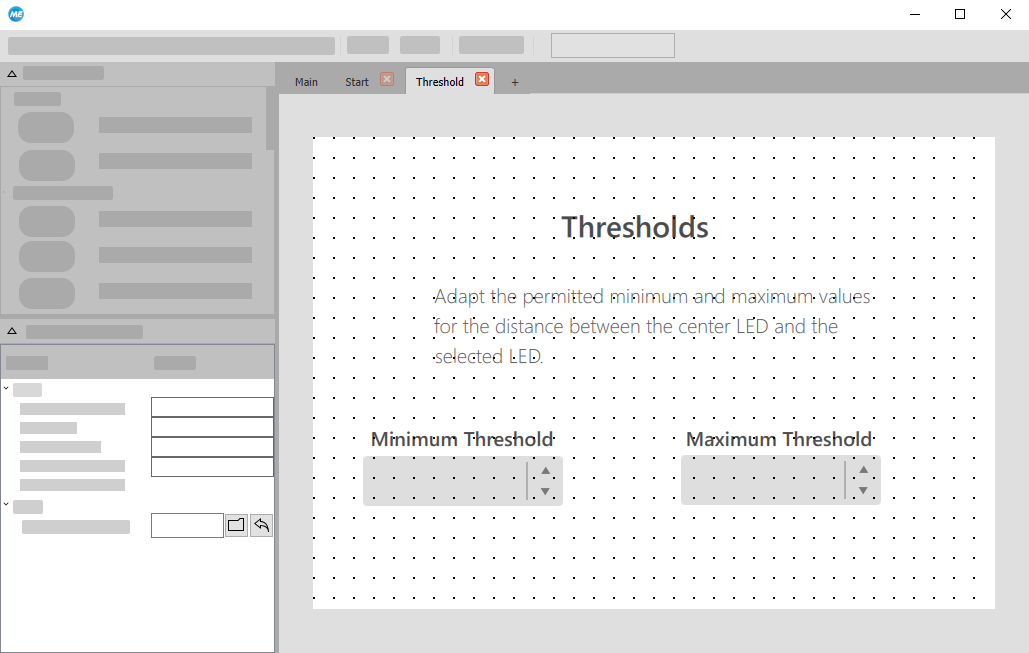
- Repeat this procedure for all additional views. In our example the view "Threshold" has been designed to adjust the values of tool parameters.
5. Checking the user interface in the Frontend
- Open the Frontend to check the design of your user interface.
- If necessary, make some further adjustments in the Designer.
The user interface of our example consists of two tab cards:
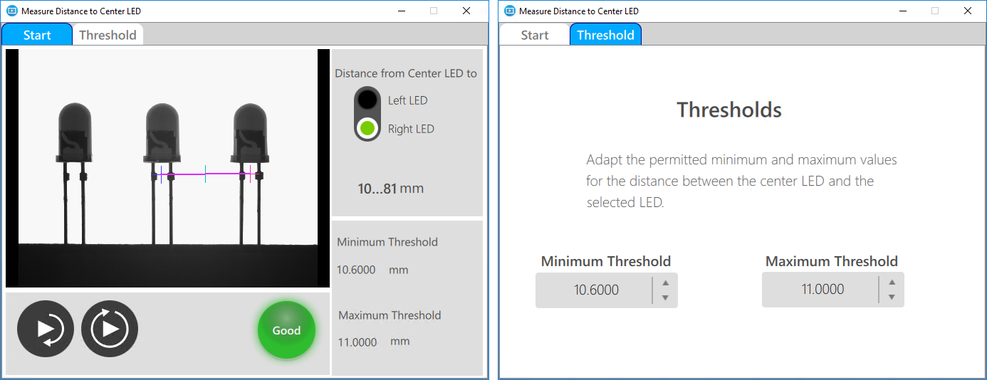
Basically the Frontend shows the start view, i.e., in our example the main view, with the "Tab View" widget. When starting the Frontend, the tab card of the view "Start" is displayed as shown in the left image. It contains all major widgets that are necessary to execute and check the application. The Frontend on the right shows the user interface of the view "Threshold". It has been configured to enable the user to change the allowed value range for the threshold.
User interfaces with tabbed views can also be used if you want to provide different user interfaces for different user groups. You can activate the Frontend user management to control the access rights of various user groups for a view and design individual user interfaces for each user group. To get more information how to define user groups and access rights, please refer to the chapter Setting up the User Management.

