Adjusting Your Widgets
Each widget has individual properties that can be adjusted. These properties are displayed in the properties panel of the MERLIC Designer. The panel only displays the properties of the currently selected widget. Thus, to view the properties of a certain widget, simply click on the widget in the workspace. In case no widget is selected the properties of the workspace are shown. You can multi-select widgets to drag them to a new position.
In general, the widgets are configured in the properties panel. Some settings, e.g., the size, position, and z-order, can also be adjusted directly in the workspace.
Widget Settings in the Properties Panel
Widget Settings in the Workspace
Widget Settings in the Properties Panel
The properties of the widgets can be adjusted via various types of input fields and editing options. These may differ depending on the widget.
In the following all types of input fields and editing options are described that may be available in the properties panel. For more information about the available properties of a specific widget, see Available Widgets.
Text Input
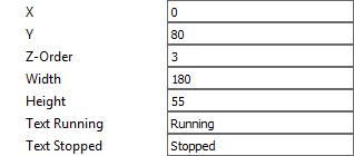
Most of the properties can be adjusted by typing the desired value into a text field. In case of numerical values, a value of a predefined value range is often required. If a value outside of the allowed value range is defined, an error message is shown which also gives information about the allowed value range.
Color Selection
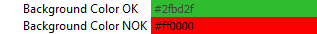
To change the color for a widget property, click into the color field and select the desired color in the dialog. The new color will then be displayed in the properties panel.
File Selection
If a file can be used for a widget property, it can be selected by clicking on the button  on the right. To restore the default, you can click on the button
  .
.

Drop-Down List
Some widget properties offer a predefined set of values, e.g., fonts or available tools. To change the value, click on the arrow and select the new value from the drop-down list.
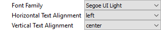
In some cases, e.g., for the font size, the value of the property can also be adjusted directly in the text field.
Connecting to Tools
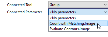
Drop-down lists are also used for widget properties that define a connection to a tool in the MERLIC Creator. The properties "Connected Tool" and "Connected Parameter" can be used to request values from a tool in the MERLIC Creator, e.g., images or regions. To connect a widget to a tool, select the desired tool and value from the drop-down lists of the respective properties.
- Select the tool you want to connect from the drop-down list of the property "Connected Tool". The list contains all tools that are used in your MERLIC Vision App and that have a tool parameter or result that fits to the respective widget.
- Select the tool parameter or result whose values you want to transfer from the drop-down list of the property "Connected Parameter". The list contains all tool parameters and results of the tool that has been selected in the property "Connected Tool".
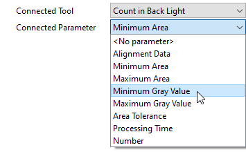
In case no tool or parameter is available for the connection, only the entry <No tool> or <No parameter>, respectively, are visible.
Connecting to Tools in a Group
Before grouping tools, make sure to connect their parameters and results in the Frontend Designer. After grouping, only values linked to the same type of Designer remain visible. MVApp parameters, MVApp results, and previously grouped values stay accessible. We recommend finalizing all tool connections before grouping tools in the Tool Workspace. For more information, see Creating and Configuring Groups.
To connect a parameter or result of a tool that is part of a group, you can proceed in the same way as connecting a parameter of a tool that is not part of a group. You just have to select the respective group for the property "Connected Tool" instead of the tool itself. The tool and parameter can then be selected in the property "Connected Parameter".
Edit Dialog
There are also some widgets with special properties that define more complex values.
To define or adjust the values for theses properties, click on the "Edit..." button to open the editing dialog with the respective configuration settings.
Depending on the widget the editing dialog enables you to make the following adjustments:
- Accessing tool parameters and results of the tools that are used in your MERLIC Vision App.
- Selecting specific values from the value list of a connected connector. The selected values will then be available in the Frontend.
- Defining a list of custom values for the connected connector. The defined values will then be available in the Frontend.
- Selecting the views that shall be visible in the Frontend.
The example image above shows properties of the widget "Image Display". These properties can be used to request iconic parameters and results, i.e., regions, contours, and regions of interest (ROIs), from the connected tool. The selected iconic values will then be displayed in the Frontend. For a more detailed description and an additional example expand the following drop-down texts. If you decide to display an ROI and edit it to be modifiable, this will only be possible as long easyTouch is not active. This means, the easyTouch Button can be present, but as long as easyTouch is activated, you can not modify the ROIs anymore, even if you defined them to be editable.
 Example: How to access iconic parameters and results for visualization
- Insert the widget Image Display into the workspace. The corresponding properties of the widget are instantly displayed in the properties panel.
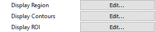
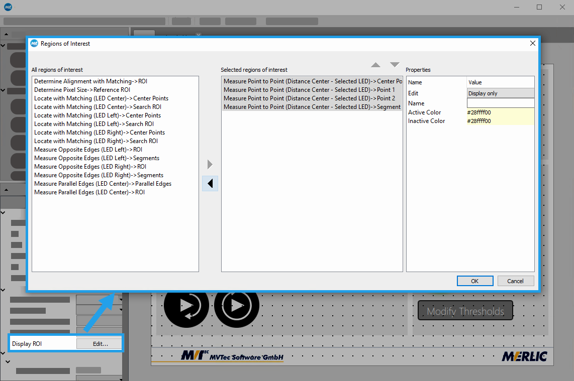
- Click on the "Edit..." button of the widget property you want to edit, e.g., "Display ROI". A new dialog opens that contains a list of all available iconic parameters and results on the left side.
- Select the iconic parameters and results you want to access.
- Add the selected values via the arrow buttons. In the example image below four regions of interest (ROIs) have been added.
- Click "OK" to confirm your selection.
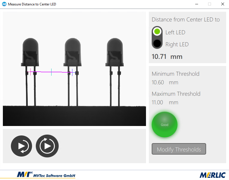
The selected values will then be displayed in the Frontend. In the example image below the selected segment ROI and the three point ROIs are visualized in the image.
Example: How to define customized values
This feature is especially useful if you want to transfer only a subset of parameter values to the Frontend.
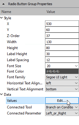
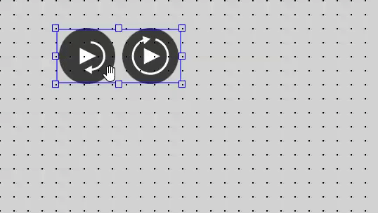
- Insert the widget "Combo Box" or "Radio Button Group" into the workspace. The corresponding properties of the widget are instantly displayed in the properties panel.
- Connect the widget to a tool from your MERLIC Vision App by selecting the respective tool at the property "Connected Tool".
- Select the connector for which you want to define the values at the property "Connected Parameter".
- Click on the "Edit..." button of the property "Values". A new window opens in which you can define your values.
- Enter the values you want to define for your widget. Each line represents one value of your connected connector. Therefore, you have to write each value into a new line.
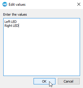
- Click "OK" to confirm your selection. The new values will be instantly visualized in the workspace of the Designer and in the Frontend.

Widget Settings in the Workspace
Beside the specific settings that can be configured in the properties panel, there are also some general properties that can be adjusted directly within the workspace.
Size and Position
How to Adjust the Size of a Widget
- Drag the borders or corners of the widget to the desired size. If the mode "Snap to Grid" is activated, the size and position of the widget will be automatically aligned to the displayed grid.
How to Adjust the Position of a Widget
- Move the mouse over the widget and drag it to the new position.
- Select the widget in the workspace and use the arrow keys of your keyboard to move the widget to the new desired position. This enables you to move the selected widgets pixel by pixel even if the mode "Snap to Grid" is activated.
Z-Order
If you are using several widgets, you can define the z-order for each widget, i.e., the order of widgets in case they are overlapping. The widget with the highest z-order is displayed in the front of all other elements whereas the widget with the lowest z-order is displayed behind all other elements. Widgets with the same z-order are sorted by the order in which they were added.
How to Adjust the Z-Order of a Widget
- Select the widget in the workspace and right-click to open the context menu.
- Select one of the following option:
- Up: Move the widget to a higher z-order, i.e., one layer to the front.
- Down: Move the widget to a lower z-order, i.e., one layer to the back.
- Bring To Front: Move the widget to the highest z-order, i.e., in front of all other elements.
- Send To Back: Move the widget to the lowest z-order, i.e., to the back of all other elements.
Group Alignment
To structure your Frontend design, you may align a group of widgets in one step. The alignment of the widget will be determined depending on the position of the last selected widget.
How to Align a Group of Widgets
- Select all widgets you want to align together and right-click to open the context menu.
- Go to the menu entry "Group Alignment" and select your preferred alignment:
- Align Left: Align the selected widgets to the left border of the last selected widget.
- Align Right: Align the selected widgets to the right border of the last selected widget.
- Align Center, Horizontally: Align the selected widgets horizontally to the center of the last selected widget.
- Align Top: Align the selected widgets to the top border of the last selected widget.
- Align Bottom: Align the selected widgets to the bottom border of the last selected widget.
- Align Center, Vertically: Align the selected widgets vertically to the center of the last selected widget.

